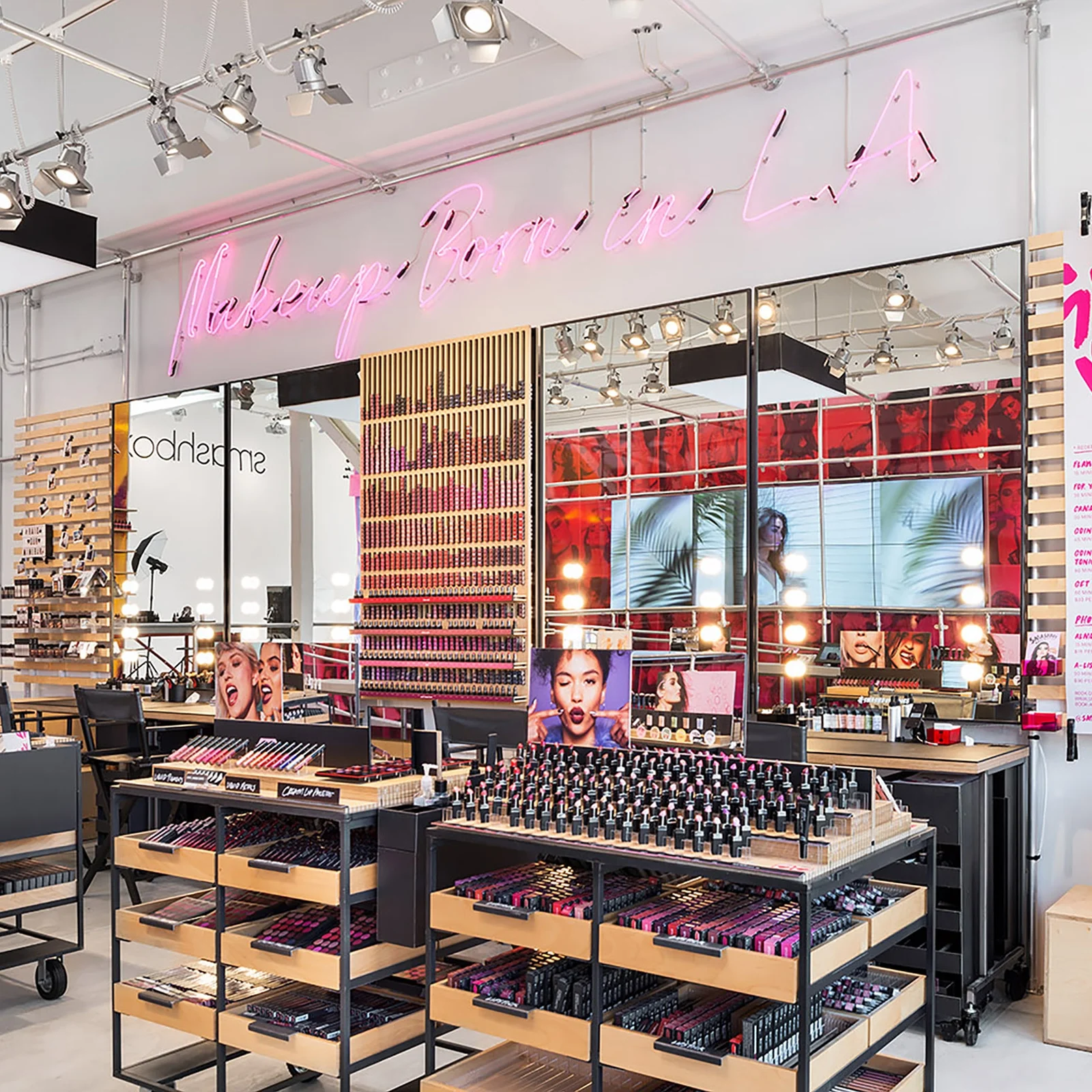
VENICE BEACH CA
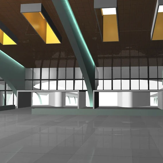
The opening of Smashbox’s Los Angeles Store on Venice Beach was designed to be an expression of all the varied elements of the brand. We wanted to create a verticality & depth to the visual merchandising, at first emulating the utilitarian look of photo studio carts. Highlighting the wood grain of apple-boxes, then executed in a very minimalist yet premium look on the merchandising which makes the color of the products pop.
The development of the lip distortion wall is a dynamic way of showing off the 120 shades of color. The vertical channels that change in stock, rising and falling - add an element of vibrant life, which you want to express with all the shades of lipstick!.
2017
Johnson & Johnson’s Global Strategic Design Office (GSDO) the head design office located in NYC. We would work on all design elements for the entire company portfolio, CHC, OTC, PHARM, BEAUTY, with Research and Marketing, while promoting many aspects of Design Thinking. As In-Store Strategy & Design, we always had to be aware of all the work of every other team, taking the design & strategy forward.
Along with having to be mindful of all the particularities of the J&J’s entire product portfolio, creating and supporting close ties with many distribution channels, developing stronger connections where we would consult, direct, and create new initiatives. Mindful of the differences of Drug / Food / Club / Other, where certain strategies will work, and knowing the particular Designs, Geographic, and Seasonal differences.
Johnson & Johnson’s fully integrated marketing approach on mapping the Shopper’s Journey, a toolkit on finding Path-to-Purchase for a Brand, Category, or a Retailer. Enriching the shopping experience, regimen, navigation to make it easy to shop, attract shoppers to new products & educate.
2013-2015
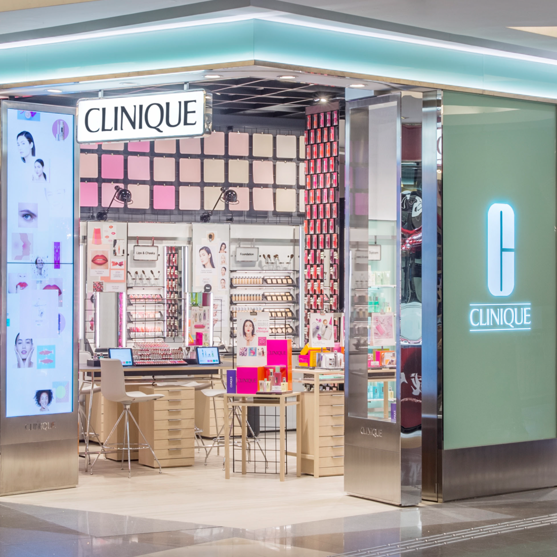
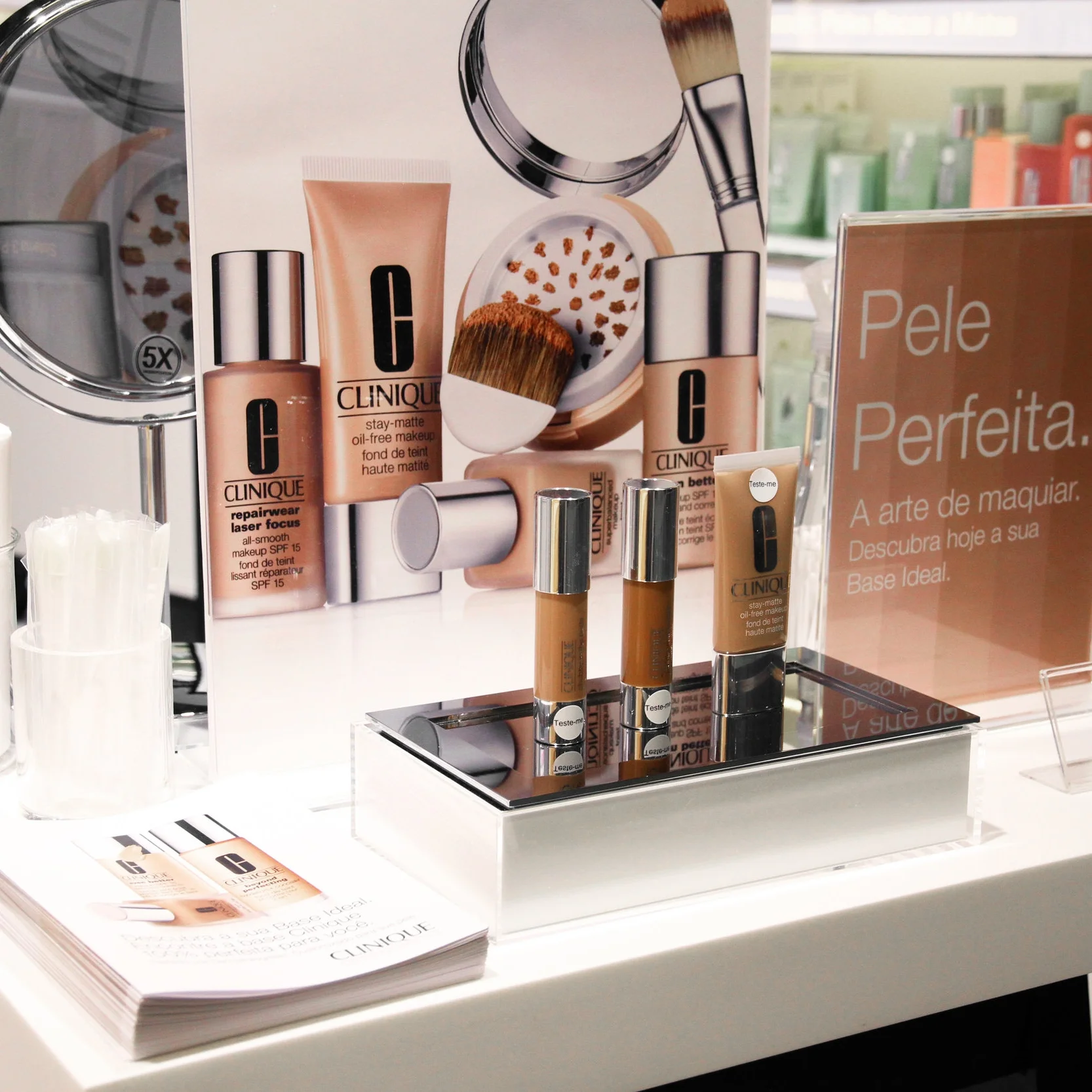
When I joined Clinique, they were just delving into their global redesign of the brand. Working on Global Visual Merchandising initially, Hong Kong was the first market to receive the new top tier flagship style look where the distinction between Makeup/Color v Skincare is writ large throughout the space. Also the larger idea of Clinique returning its roots, where the stand out element that put them on the map was their editorial style, spearheaded by Irving Penn’s photography in the 60’s - Editorial Studio look. The Makeup/Color space is designed with editorial elements, pin boards to "Get the Look".
The standard tier retail look also launched in Hong Kong, clean white fixtures that let the color pop, also moving away from overt Clinique jade panels, yet playing with materials that lend themselves to that shade. Playing with iron levels in glass that purposely show green edge highlights, thin black frame outlines that frame the colorful product with graphics seamlessly. I designed over 40 Clinique doors in this fashion throughout all Latin American Markets.
Along with the new flagship & standard tiers being rolled out, another style Pop-Up was created. This design was based on the travel crates units used in photo-shoots, film production, and equipment cases. Leaning towards a younger demographic, this style is deployable very quickly yet still conveys a posh / upscale style. The color pops out of the clean, attractive white trunk cases. This first deployment for the new basement section at Macy’s Herald Sq.
2015-2016
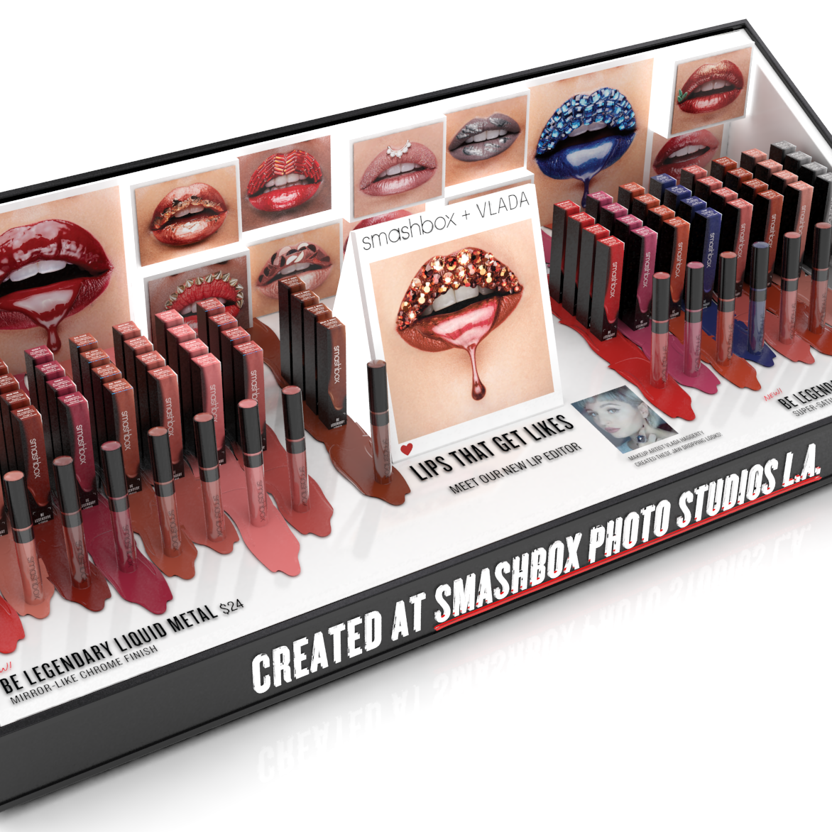
I became the face of Visual Merchandise concept development at Smashbox. Rapid 3D design & rendering for new and existing product SKUs and the retail specific displays for them. Sephora gondola fixture design, emulating the look & emotion in 3D space. Creating noticeable impacts at Ulta, Macy's and other retailers; promoting collection differentiation & highlighting campaigns, but mindful of a brand collective look.
2016-2017
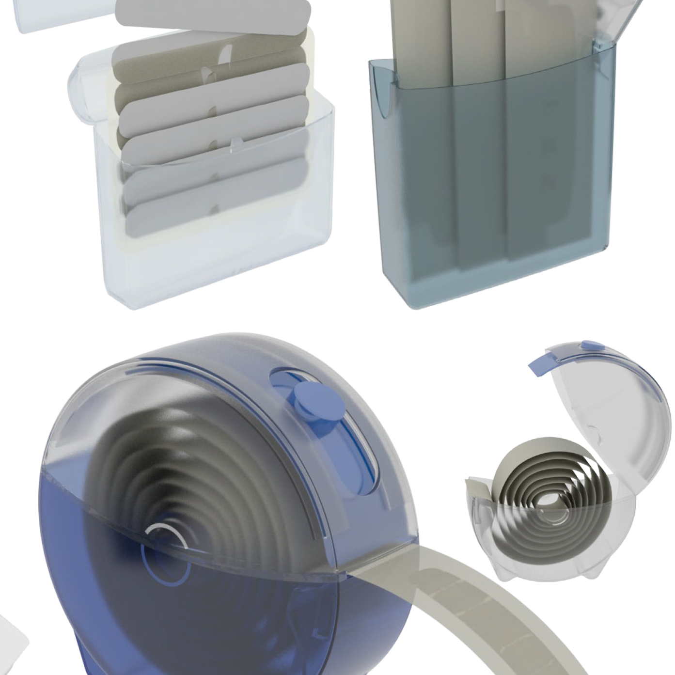
Developing Next Generation BAND-AID® Tin.
Along with the redesign of the WaterBlock Plus bandages, thought was given to creating a new secondary packaging. Designed to accompany the 100% Waterproof features of the bandage.
• Communicate waterproof performance
• Represent Brand Equity
• Simple, Elegant usage
CLINIQUE PAULISTA POP-UP
SAO PAULO BRAZIL
As I lead design for all LATAM Stores & Visual Merchandising, this includes Free Standing Stores, Department Stores & Counters, Pop-Ups, Kiosks and Travel Retail. Over the course of 5 months I spearheaded the design for just over 45 different doors from Mexico City down to Buenos Aires.
2016
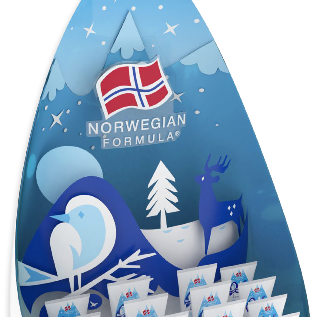
A Limited Edition design for the iconic Norwegian Formula Hand Cream was created to be launched during the Love Winter Campaign of 2015. Norwegian illustrators, Darling Clementine created the illustrations to celebrate Norwegian heritage.
Darling Clementine is a Norway based company founded in 2006 by Ingrid Reithaug and Tonje Holand. Products currently include stationery, tableware, textiles and homewares. All products are made with a distinct focus on craftsmanship and quality.
2015 UK
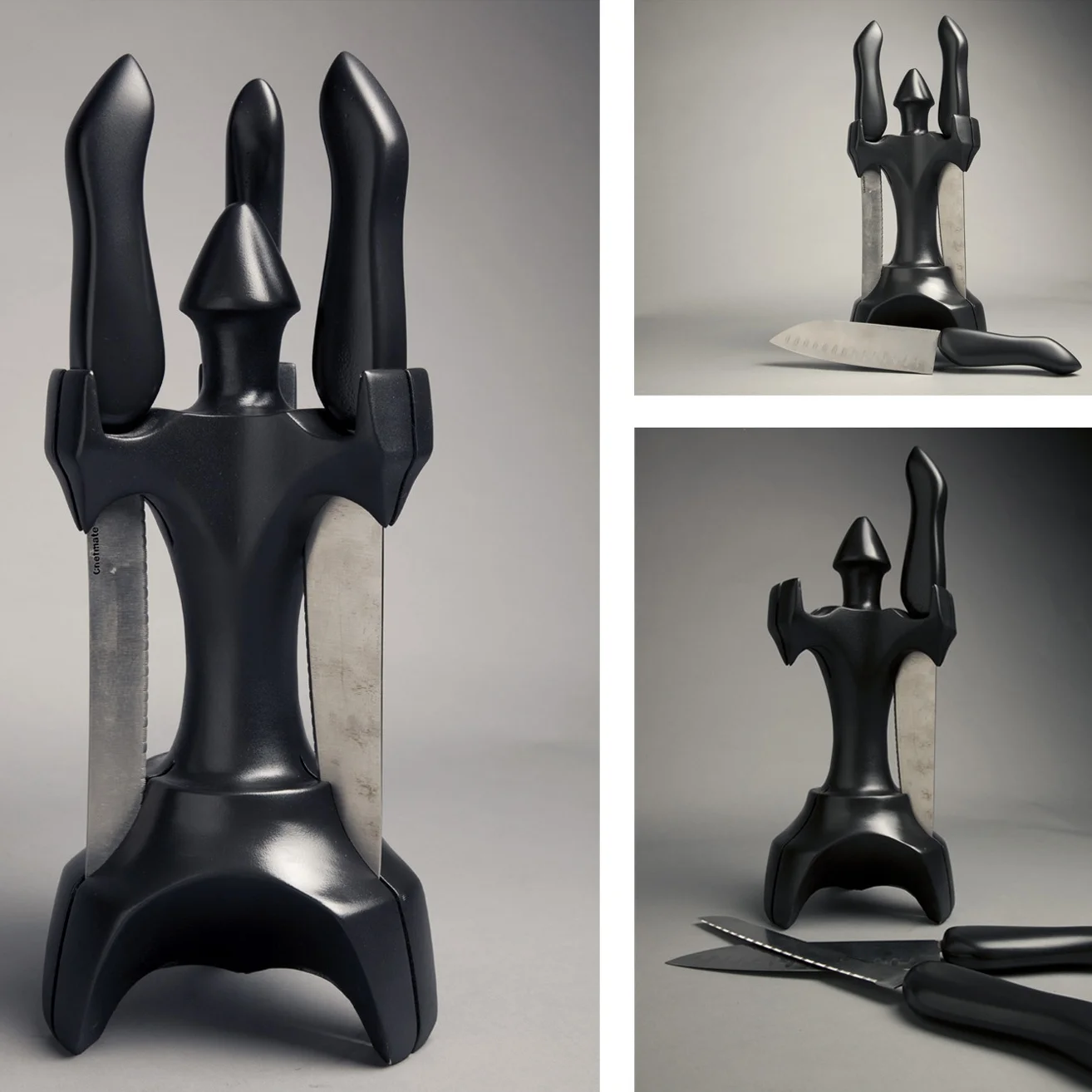
Design & Fabrication Exploration of ergonomic handles.
2007
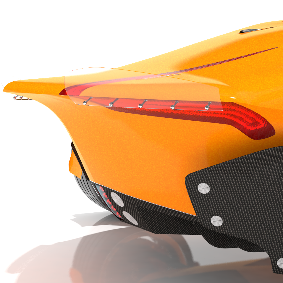
ELECTRIC SPORTS CAR
Initially designed as a homage to the HWM Stovebolt Special from the early 50’s, the design scope was extended, pushed further until it become something actually new and not just only an aesthetic exercise. The most notable design aspect is the Front Wings. They are placed above the wheels where they are integrated into the upper control-arms, molded as inverted wings where the air flow pushes the front suspension downward into the ground. The front edge of the wing has an integrated LED strip that runs the full length of the aero-foil as it wraps around the leading edge down the side and goes from driving light to parking light / indicator.
This car’s aim is to deliver the highest performance experience for the lowest running cost - a True Supercar. While other performance cars may have the highest top speeds & lowest 0-100 times, they also have the highest fuel costs, Highest output of CO2 gas, and lowest mpg numbers on the market; how is that Super? That’s annoying.
A Supercar should be like Superman.
Do Everything.
Perfectly.
Performance.
Experience.
Efficiency.
Safety.
2012
NATURAL DISASTER RELIEF HOUSING
PROBLEM - 300,000 people die every year in Natural Disasters, and thousands more loose their jobs, forms of person transportation, and homes. Displaced in their own region or moved to a safer location by themselves or another organization, they have just become homeless. Natural Disasters happen all around the world, where there are numerous different Conditions, Climates, & Cultures. Southeast Asia is hit with a variety of natural disasters regularly: high humidity, monsoon, tsunamis, floods, earthquakes, & volcanoes.
What is the next step to be performed by or for those survivors?
Geographically the region is a special because it lies on 2 fault-line zones: Australasia & Pacific Plates. The regional average annually temperature is 800F, with annual rainfall is at 9 ft.
Consisting of lagoons, island bays, beaches, hills & valleys, mountainous ranges with peaks reaching over 16,000 ft, over 300 volcanoes located over 4 million square kilometers, with half being active.
CHALLENGES
• Doesn’t ease the senses - claustrophobic
• Lack of windows not enough natural light
• Lack of multiple materials - colors
• Lack of user customizability
• Size dictates number of units delivered
• Size & build dictates how it is delivered
• Shelter vulnerable to original disaster
• Shelter Design - simple or complicated
• Necessity of user to have building skill
• Speed & Ease of assembly / set up
Finalizing on the folding concept, I focused on keeping the shape but minimize the parts, flaps to make assembly of the shelter obvious and easy. To maintain a structure with usable square footage, it had to be a box rather than a pyramid or sloped asymmetrical shelter. Looking at various folding methods for a cube, settled on the folding of a paper bag. Then took two bags and put the bottoms to each other, so when the framework unfolded through 1800, its own leverage would cantilever the structure up. After erected, the weight of the user, just occupying the structure - keeps it open.
Cotton-Blended Nylon Rip-Stop chosen to reinforce folded joint seams and gap openings because of its toughness, high water resistance. Developed by the US military in 1960’s, still a soft breathable material. 4mm Polycarbonate Corrugated Fluted Panels chosen as the main structure material for its light weight, rigidity, waterproof, inability to grow mold, double walled translucent, and used in greenhouses it can maintain a friendly interior temperature.
21 shelters in ONE Shipping Container
A SINGLE shelter can house 8 people
ONE shipment can house 168 people
2009
PATERSON INTERNATIONAL HIGH SCHOOL
PATERSON NJ
The International High School is the highlight in an academy system envisioned by Paterson Public Schools Committee, initially devised with input from the educators, administrators, city government, to be in the spirit of the United Nations.
The narrow site posed a design challenge, where our response resulted in program spaces, classrooms and smaller modular spaces promoting personal instruction - having the architectural design improve the user experience and interaction. The center of the school is situated around a 3 story skylight atrium, creating more public spaces for the student community, brining in natural light. The main staircase overlooks the Paterson business district through the large waterfall facade windows. The main curriculum building is flanked by the Gym / Sports Facilities on the south-side, Auditorium / Music classrooms on the north-side.
In the style of AIGA International Symbol Signs to represent different school curriculum subjects and departments. After an extensive design exploration, 20 final designs were chosen, developed, & laser cut out of aluminum sheets.
$43 Million 115k Sqft 500+ Students 4 Acre Site
2005-2008
Moving from my Undergrad Final to a Graduate project, I was asked to come up with a concept military shelter -
“Tip of the Spear” operations.
The main testing goal for the Composite System was for it to provide protection from 2582 ft lbs of force which is 3500 joules or a 7.62 / 30-06 round - the typical round fired from an AK-47.
- Geo-Frame Shelter, built by a group taking over 2 Hours
- Nazi Half-Track, Angled armored walls have helped in protecting the crew inside amazingly With the cross section of an “angled” piece of armor is thicker than the same piece of armor up-right.
- M1117 Multi-Role transport, angled panels provide arms fire deflection
- MRAP Mine & IED proof transport Multilayer/Deflection Chassis
- IAV Stryker eight-wheeled, 4-wheel-drive, armored fighting vehicles The high ground clearance, smooth by angled exterior makes it best for survivability without actually being a tank.
- SLAT Tiles - External layer/fence with buffer space that pre-triggers explosive rounds.
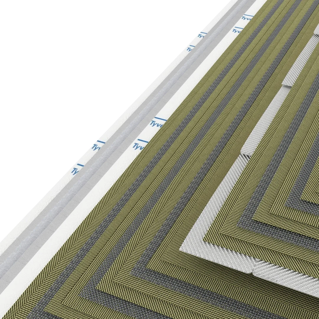
The best solution to deal with the impact force while attaining a light weight is - the materials will have to break the typical rules. Use of Non-Newtonian Fluids, a material that hardens when force is applied abruptly, but returns to a soft state when left alone. This material absorbs the brunt of the impact force, while harden composite layers would work in conjunction at breaking the bullet’s jacket & flattening the round to dissipate its mass over a angled surface.
Angled Walls for better protection from small to medium rounds, dissipating the energy of glancing shots. Walls composed of sandwiching 3 staggered layers of Composite Panels and 2 layers of Non-Newtonian Tiles, resulting in a total wall thickness of .75-1.25 inches. Interior made from Prodex High Performing Insulation between 2 layers of Tyvek Vapor Barrier material.
2012Stevens Institute of Technology Sponsored Project
The increasing Size & Slope of automobile’s A-Pillars in the last 15-20 years have created a new blind-spot - Forward of the Driver.
This has come with the new measures for protecting the passenger cell, extending the forward Crumple Zones, this extends the Dashboard, increasing a shallow slope of a car’s A-Pillar; which does aid in aerodynamics - promoting fuel efficiency. The A-Pillar therefore needs to be thickened to provide the strength creating the blind-spot.
This blind-spot can be attributed to a 20% of all traffic accidents classified as Looked But Failed To See (LBFTS), attributed to cars built in the last 20 years - according to the UK Dept. For Transport (DFT).
Volvo’s Safety Car Concept addressed this issue, but the production C30 did not.
Toyota’s FT-86 Concept addressed this, the production FR-S did not.
Kia’s GT4 Concept addressed this...where is it?
SOLUTION
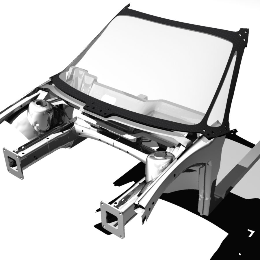
Composite Windshield frame fastened to chassis. Made from Carbon Fiber / Carbon Plastic to produce the strength needed at a much more reduced mass. Engineering certain chassis elements from materials some consider exotic, but only for their performance benefit in an application.
Concept Composite Windshield Frame Applied to a mid 2000s Ford Focus chassis (EU) Chosen for its very high safety rating & best selling record.
2011
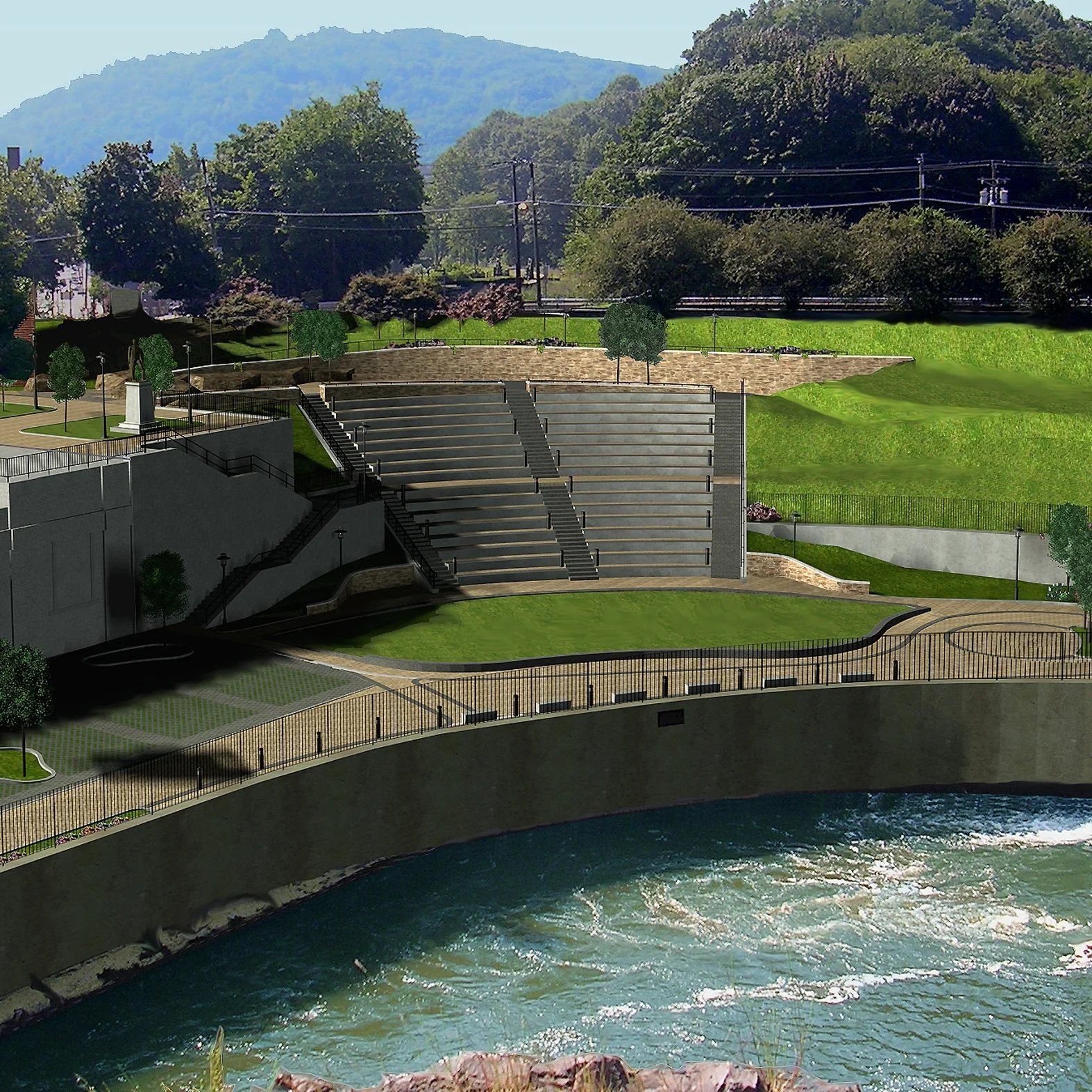
GREAT FALLS OVERLOOK PARK
PATERSON NJ
Prominent waterfall site in northern New Jersey on the Passaic River, in Great Falls National State Park, located in the city of Paterson,
this $2.2 million parks project was to design a park situated at the base of the falls to accentuate the natural wonder as a focal point.
2005-2006
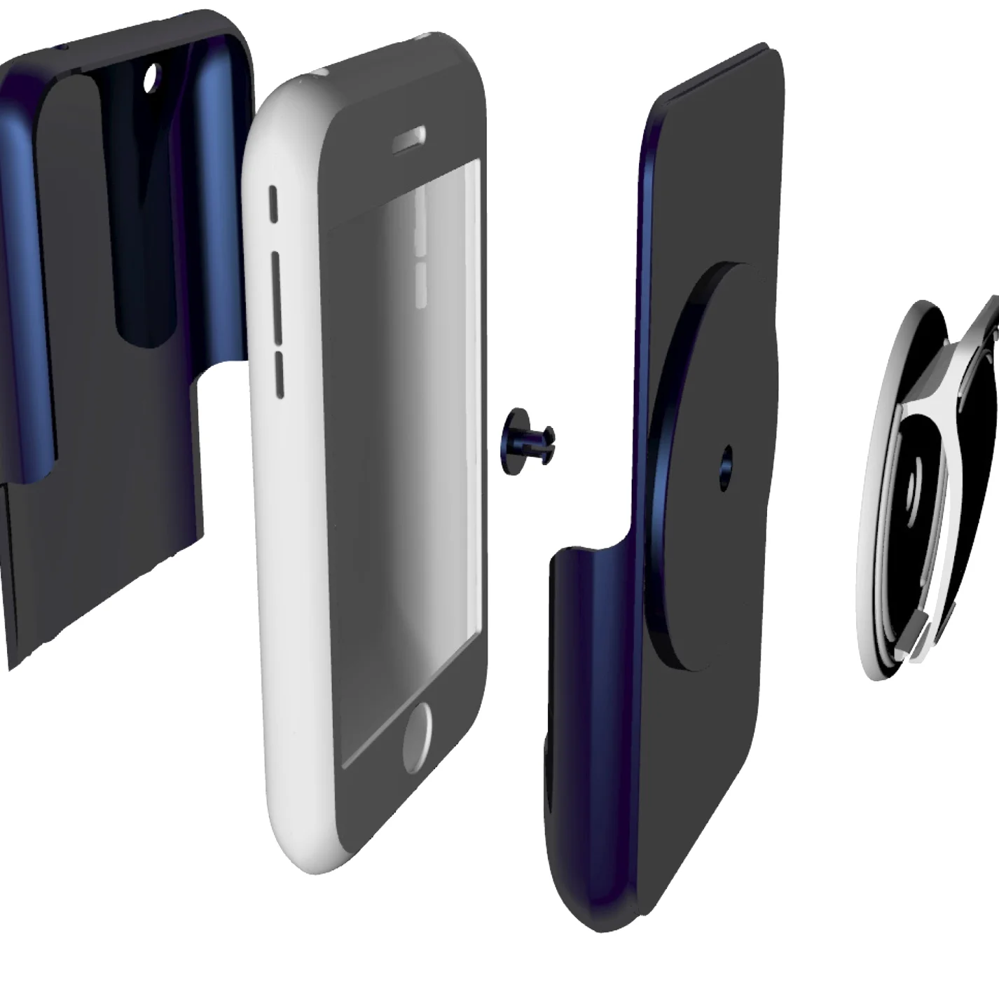
AT&T CASE-MATE
Sponsored project at SCAD, Casemate came to our ID dept with unreleased smart phones to have us create new lines product accessories for a variety of markets.
2008
LINCOLN SCHOOL EARLY CHILDHOOD ANNEX
NORTH BERGEN NJ
The Lincoln School Pre-Kindergarten and Kindergarten Center is a new facility for a district-wide Pre-Kindergarten and Kindergarten Program, including 22 classrooms, Small Group Instruction areas, kitchen, cafeteria / gym, stage/multi-use room, computer room, offices, and related support facilities. All spaces are organized around a two-story interior atrium, which provides informal gathering areas for staff and students and brings light to the core of the building. This two-story, 80,000 square foot addition adjoins an existing school building.
A community entry to the multi-use room, kitchen and computer rooms, and a new accessible elevator and service core were created as the link between the two buildings. Improvements to the existing 60,000 sq ft school, including door replacements, circulation improvements, as well as provision of on grade parking serving both facilities are part of the project. Completed in 2006, the school was one of the largest urban early childhood centers in New Jersey dedicated exclusively to pre-k and kindergarten children. Educational planning, site planning, design and construction documents were provided for swing space temporary classrooms units on remote site in North Hudson Park. Sixteen classroom units as well as an administration and nurses unit housed students while the permanent facility is under construction.
The program for Early Childhood Construction and Renovation includes several major projects as part of the District's comprehensive commitment to provide Early Childhood (full day kindergarten and half-day Pre-kindergarten) "in-house" to assure compliance with educational standards.
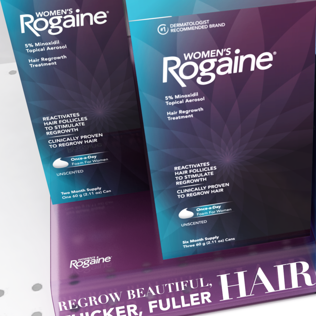
In 2015 the Women’s Rogaine® was relaunched with new products and a new look. Updating its packaging drastically to be more in line with women’s glamour products and media, moving away from it’s former minor position relative to Rogaine® for Men. The graphics, typefaces, and photography is meant to emulate the look of glamour magazines and fashion photography.
2015
AT THE TIME...
Back in 2008 looking at net-book market, looking for opportunities among the growing smart phone market, hand held gaming devices, cameras. Freescale aided in the project with their expertise with ARM processors.
What is a Work Station?
Desk - Fixed Chair - Adjustable Chair - Stool - Coffee Table - Couch - Lap - Bed - Stomach - Floor - Countertop - Standing
• TMJ (Temporomandibular Joint)
• RSI (Repetitive Stress Injury)
• CVS (Computer Vision Syndrome)
• CTD (Cumulative Trauma Disorder)
Traditional 11” Tablet laptop look with touchscreen, E-Ink screen cover, and pop-out stylus. Lid mounted positionable camera that can face them or their POV.
DESIGN
• Adjustable screen / fixed keyboard (or reverse)
• Separate keyboard, mouse, touch pad / pin
• Matte / gloss screen - brightness
• Speaker location
• Stylus
TODAY
Since early 2009 the tech landscape has changed significantly, with the debut of the iPad and the growing tablet market. Net books evolved into tablets/ultra books.
Interesting to see 2 of my particular concept elements carried out into the market place with the HP Spectre X2 detachable screen and the YotaPhone 2’s E-Ink backside.
2009
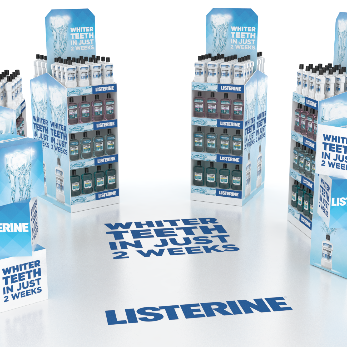
The UK Listerine Advanced White campaign was special because we went down the additional avenue of promoting it as a beauty product. Product shots, models & mood similar to Dermo-Cosmetic brands. Secondary product debut locations in the beauty aisle next to adjacent J&J brands.
2015
2012
The Glenn D. Cunningham Early Childhood Center is an adaptive re-use of an existing light manufacturing facility, including gut renovation and restoration of the existing brick facade in a densely-built urban neighborhood. This small, community-based school contains five classrooms, an Indoor Play Area, and support services for full-day and after-care programs.
The existing building occupied the full site. Creation of a bright, well lit interior play space was critical. A 14’ high vaulted ceiling and large East / West windows were created to provide a sense of openness and abundant daylight; these features are clearly visible from the street.
Brick, cast stone, signage and window guards were detailed to create a strong identity as a valued community resource. The paper cut motifs in window guards and signage and the bright blue ‘cloud’ equipment screens mark the project as a children's facility.
Interior windows were used to bring in light through multiple surfaces. Tile patterns were chosen to visually coordinate with window systems, finishes, and lighting.
Patterns that evoke board games were chosen for floor treatments.
2006
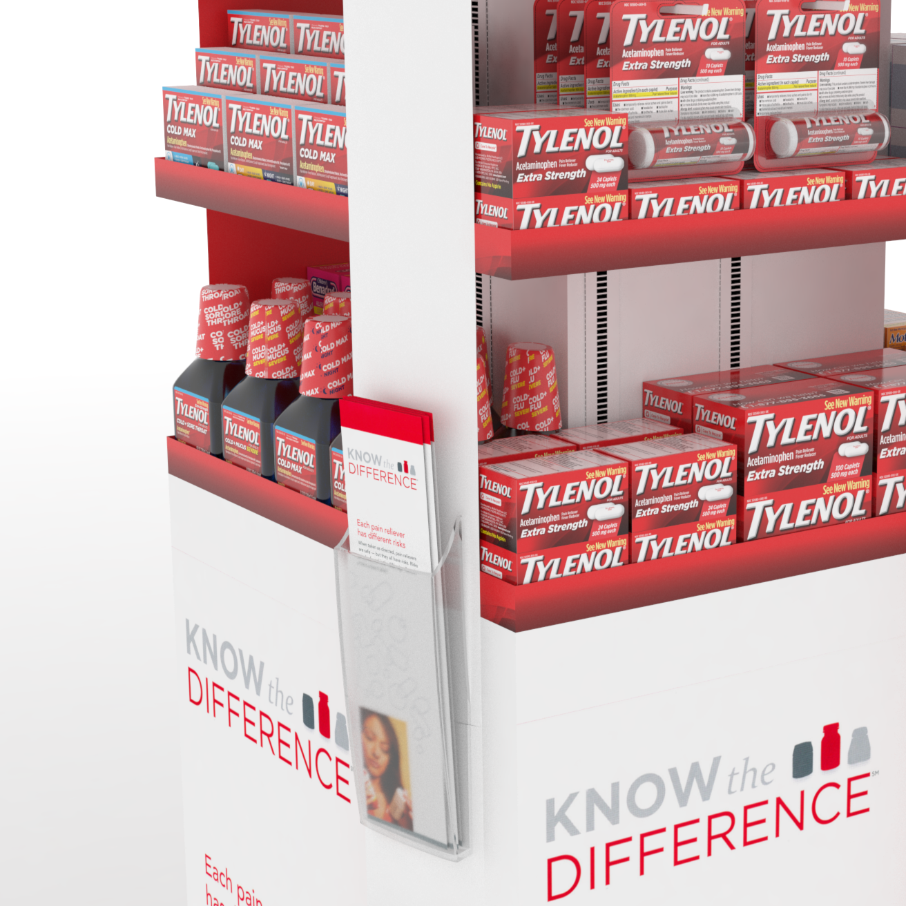
After the relaunching of the new look Tylenol® and coinciding with the later launch of Tylenol® PM, we needed to design the next in-store vehicles for that would support the following product launches for the brand.
To increase the visibility of Tylenol® products year-round (especially Extra Strength Tylenol®) and drive cross-purchase by creating a semi-permanent structure to be up year-round, with modular shelving & graphics that can be swapped out throughout the year to match with seasonal mega-brand targets.
Communication Direction:
1. Tonality- Reliable, Confident, Accomplished, Authentic
2. Leverage a sense of Tylenol® mega-brand equity(red) while being brand family agnostic.
3. Attract shopper attention
4. Call out separate conditions on each side - Pain / Sleeplessness / Pediatric / Seasonal
5. Regain market share in category
6. Drive in-store conversion
2015
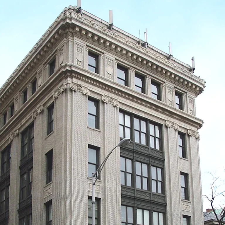
Built in the 1920s, this handsome masonry and terra cotta built building, the Seaboard Building is located adjacent to the Hoboken Waterfront in the southern Hoboken Historic District. Investigative probes identified the nature of the underlying structure and extent of damage. Hazardous conditions of the upper cornice required extensive terra cotta repair, structural reinforcement, sealants, re-pointing of all masonry and related roof repair.
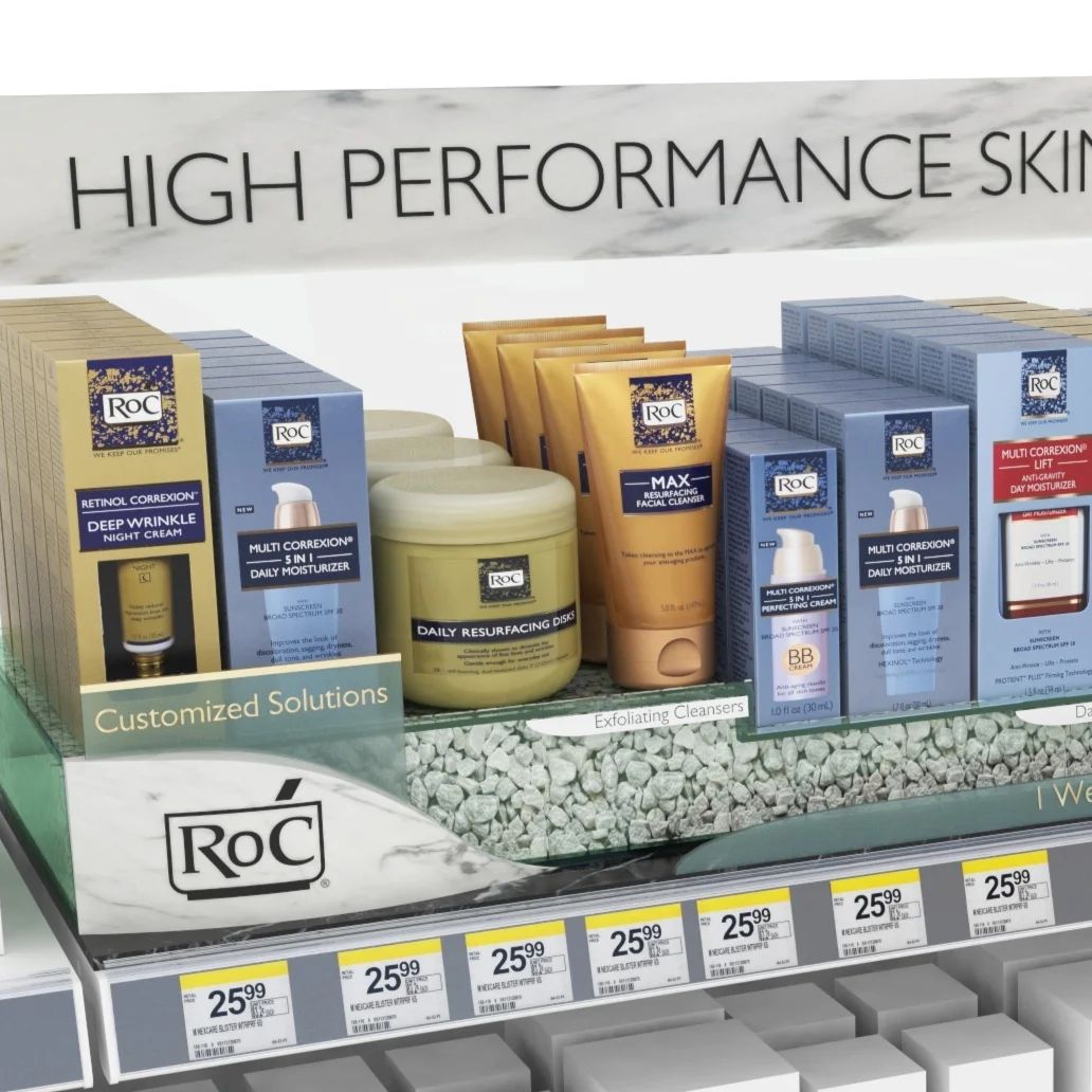
We saw that RoC® Skincare was lacking awareness in the anti-aging facial skincare category. With the growing Cosmo-Derm market, we were tasked at providing an elevated new look at shelf is critical to convey the key aspects, differences, and superior anti-aging efficacy of RoC® Therefore ensuring that the brand stands out at shelf more prominently to increase awareness & education.
2014
2014
Computer Modeling 3D Studio Max 7
2002
2014
2008
Computer Modeling Rhinoceros 3D
2007