Colin Bradley Martin
Industrial Designer
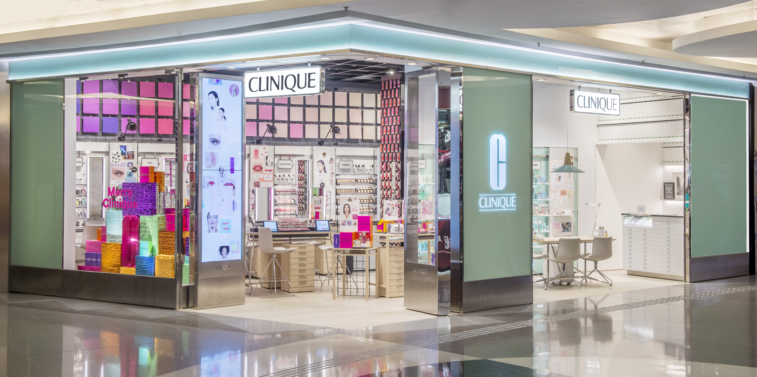
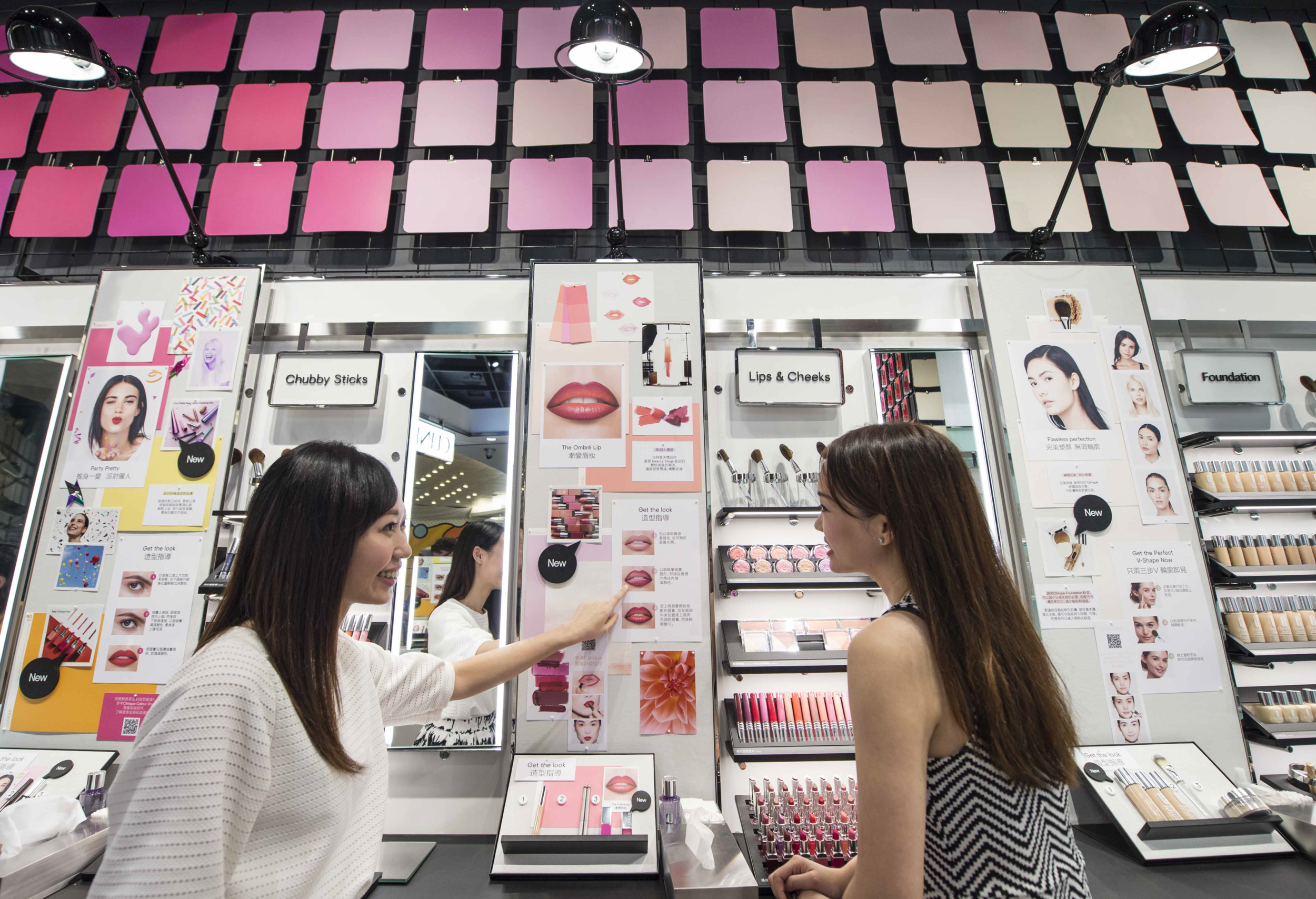
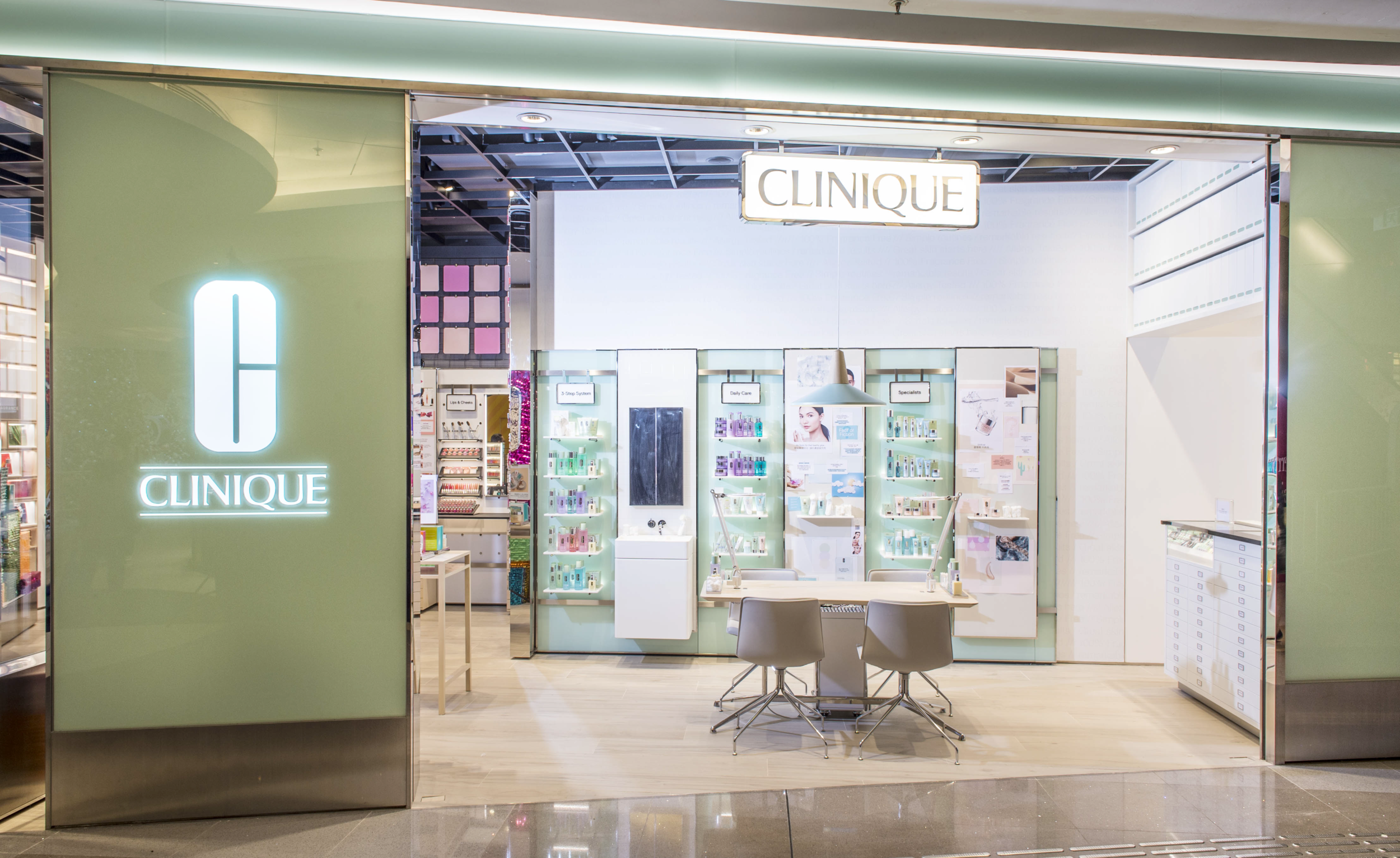
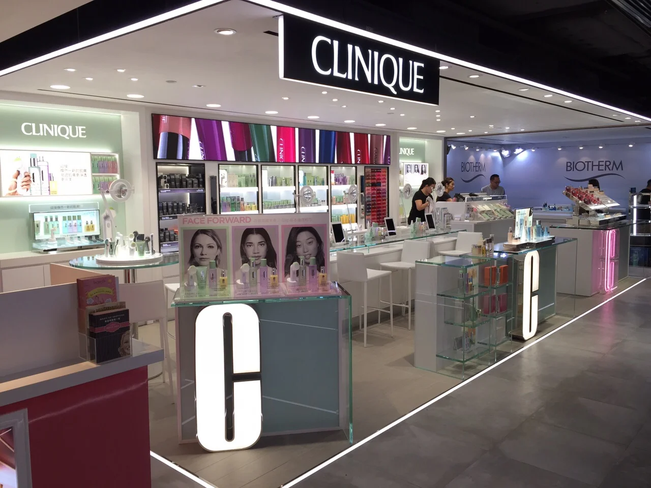
When I joined Clinique, they were just delving into their global redesign of the brand. Working on Global Visual Merchandising initially, Hong Kong was the first market to receive the new top tier flagship style look where the distinction between Makeup/Color v Skincare is writ large throughout the space. Also the larger idea of Clinique returning its roots, where the stand out element that put them on the map was their editorial style, spearheaded by Irving Penn’s photography in the 60’s - Editorial Studio look. The Makeup/Color space is designed with editorial elements, pin boards to "Get the Look".
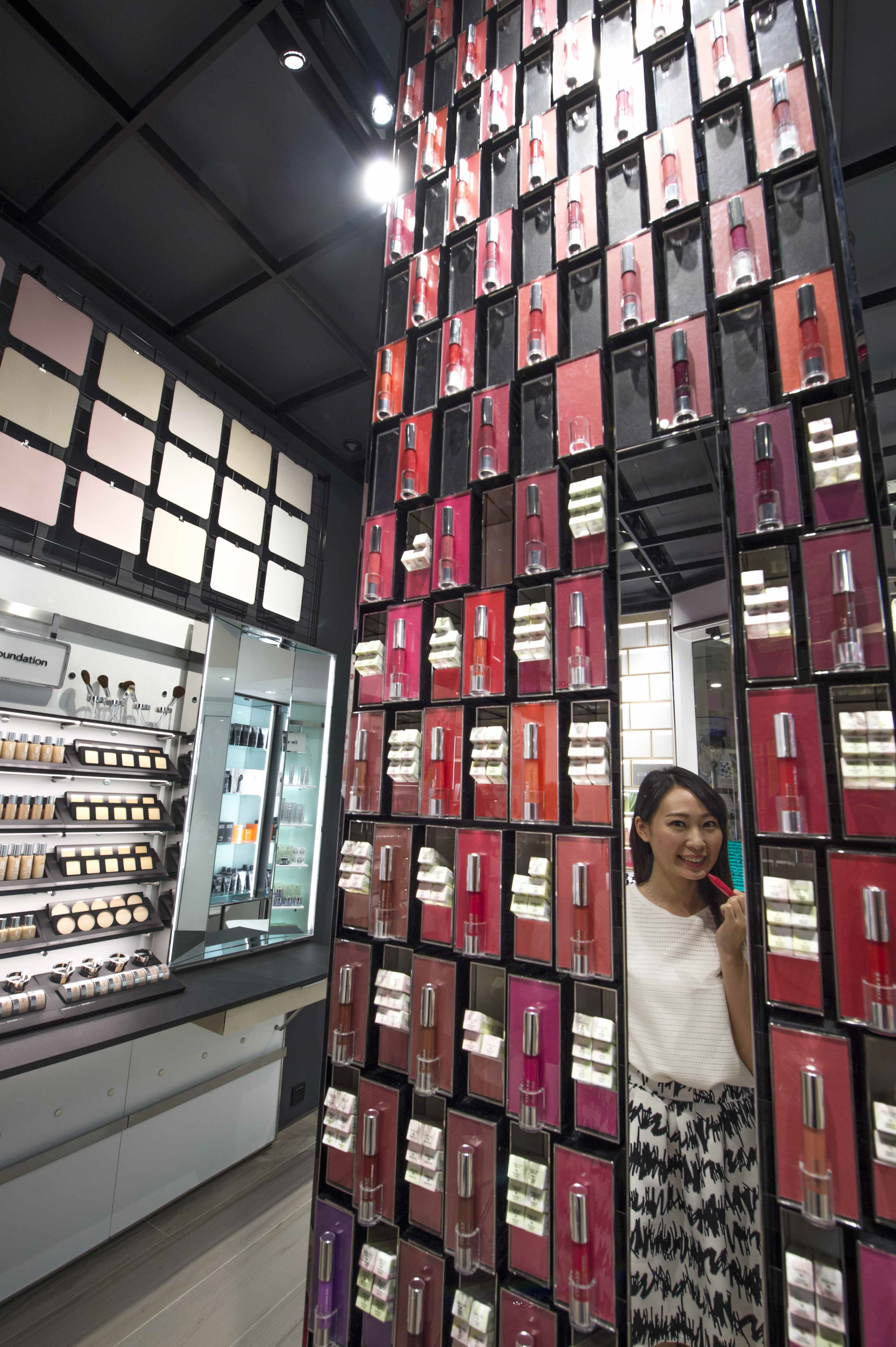
The standard tier retail look also launched in Hong Kong, clean white fixtures that let the color pop, also moving away from overt Clinique jade panels, yet playing with materials that lend themselves to that shade. Playing with iron levels in glass that purposely show green edge highlights, thin black frame outlines that frame the colorful product with graphics seamlessly. I designed over 40 Clinique doors in this fashion throughout all Latin American Markets.
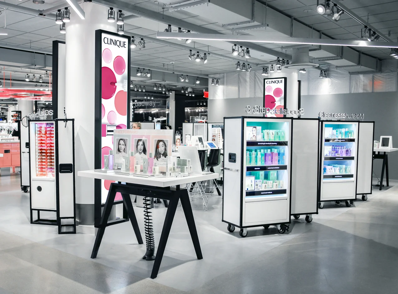
Along with the new flagship & standard tiers being rolled out, another style Pop-Up was created. This design was based on the travel crates units used in photo-shoots, film production, and equipment cases. Leaning towards a younger demographic, this style is deployable very quickly yet still conveys a posh / upscale style. The color pops out of the clean, attractive white trunk cases. This first deployment for the new basement section at Macy’s Herald Sq.
2015-2016